

2013 Financial Benchmark Charts and Graphs
To be used for illustrative and educational purposes.
No recommendations should be inferred from the information presented.
Past results are no indicator of future performance.
These charts continue an annual tradition I started ages ago. I use these when I do financial planning with clients. The charts below show the 10-year annual and cumulative percentage gains or losses of the major stock market indexes, interest rates, currencies and gold. Also shown, is a comparison of an investment 10 years ago in the Dow Jones Industrial Average (DJIA) compared to an investment in a 5-year Bank CD that was rolled over when it came due into another 5-year CD.
10-year financial benchmark performance of
major stock indexes, interest rates, currencies and gold
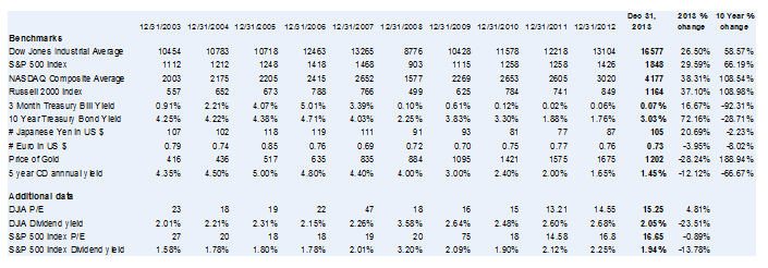
(Click to enlarge)
Annual percentage gains or losses of four major stock indexes
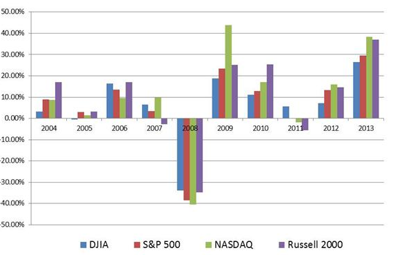
(Click to enlarge)
Cumulative percentage gains or losses of four major indexes
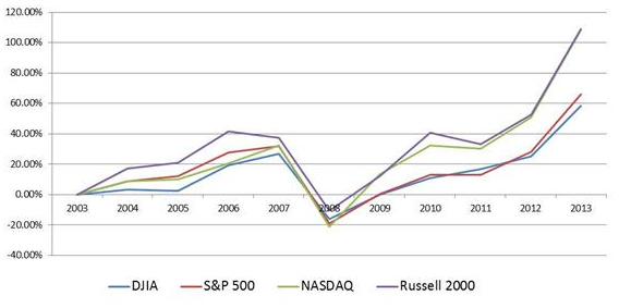 (Click to enlarge)
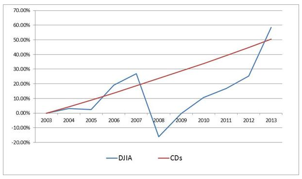
Ten year comparison between the DJIA and Bank 5-year CDs
This graph compares the 10-year DJIA performance and two 5-year CDs with one purchased at the beginning of a 10-year period and the other rolled over for another 5-year period when the first CD came due. The CD rate was 4.35% at the beginning of the period and 4% on Jan 1, 2009. Note that the strategy for today might be different with CD buyers possibly investing for 1 or 2 years rather than 5-years.
 (Click to enlarge)
How Can We Help?